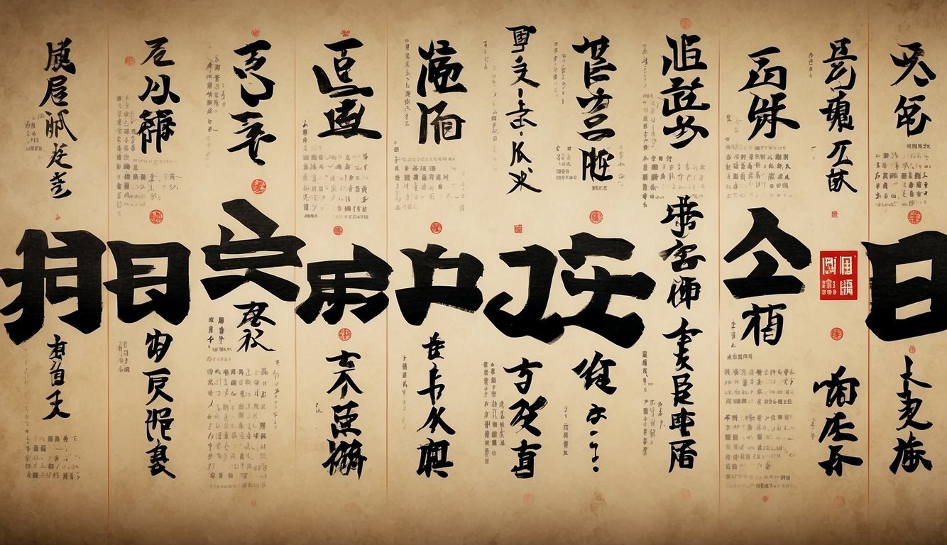
Are you fascinated by Japanese fonts? I share your enthusiasm!
I know how thrilling it is to explore the unique flair of Japanese bold styles. That’s why I’ve spent time discovering the best options for you!
I’m thrilled to introduce you to the captivating world of Japanese bold fonts. These fonts blend tradition with modernity, creating designs perfect for headers, titles, and eye-catching graphics.
So, why wait? Dive in and explore the exciting world of Japanese bold fonts! 🙂
History and Evolution of Japanese Bold Typefaces

I’m absolutely fascinated by the rich history and evolution of bold typefaces in Japanese design!
From early printing influences to post-war innovations, the journey of Japanese bold typefaces showcases creativity and cultural transformation.

Early Development in Japanese Printing
The story of Japanese bold typefaces begins with the introduction of Chinese characters around 500 A.D.
These characters, known as Kanji, laid the foundational elements for Japanese writing systems, which evolved into three separate systems: Kanji, Hiragana, and Katakana.
In early Japanese printing, woodblock printing played a crucial role.
Artisans meticulously carved characters into wooden blocks, emphasizing clarity and definition.
The desire for readable and impactful texts led to the creation of early bold typefaces. Texts needed to stand out, especially in religious documents and official records.
With the advent of movable type printing, Japanese typographers experimented with bolder styles.
These bold characters were not just functional; they carried an aesthetic weight that highlighted important texts.
Such advancements paved the way for more intricate and visually striking typeface designs in the years to come.
Hey you! Are you interested in more aesthetics? Then be sure to check out our top articles! You definitely can’t miss it!
Japanese Aesthetic 2024: The Beauty of Simplicity and Harmony
90s Japan Aesthetic: The Era’s Best Iconic Styles and Culture 2024
Post-War Era Bold Typeface Innovation
The post-World War II era marked a significant transformation in Japanese bold typefaces.
The influence of Western design principles blended with traditional Japanese aesthetics, spurring creativity in typeface innovation.
One notable figure in this period was the master of three-dimensional typography, who explored new possibilities with 3D type.
Designers began experimenting with axonometric lettering, which appeared on various media, including magazine covers and posters.
This period also saw the emergence of bold, chunky typefaces that drew inspiration from avant-garde movements of the 1920s.
Such bold typefaces were characterized by their strong visual impact and sculptural forms.
These innovations pushed the boundaries of traditional typography and established new standards for Japanese graphic design.
The legacy of post-war bold typeface innovation continues to influence modern typography trends in Japan today.
Characteristics of Bold Type in Japanese Script

I love exploring the unique characteristics of bold type in Japanese script!
Bold letters play a significant role in enhancing visual communication, offering a distinct flair that combines tradition and modernity.
Visual Impact of Japanese Bold
Japanese bold type stands out due to its dynamic and striking appearance. The thickness of the strokes presents a powerful visual emphasis, ideal for headlines and important text.
It’s interesting that bold Japanese fonts are not just another style of the same font but are technically separate fonts, like in Helvetica Neue.
This separation is essential because it maintains the clarity and impact of the bold style without compromising the overall design’s readability.
Whether used for Kanji, Hiragana, or Katakana, bold type can effectively highlight critical information.
This is particularly useful in advertising and design, where grabbing attention quickly is crucial.
Comparative Weight and Usage
The comparative weight in Japanese bold fonts varies significantly from standard fonts.
While Western fonts might have straightforward variations like regular or bold, Japanese fonts often require separate font files for each weight, as noted by Kilian Muster.
This complexity ensures that each weight maintains its intended aesthetic.
In practical terms, bold Japanese fonts are used to create emphasis or draw attention to specific parts of the text, a strategy quite similar to Western typographic use.
Choosing the right type of bold is crucial depending on the context—traditional designs might lean towards a more elegant and refined bold type, while contemporary and dynamic projects might use bolder, more assertive strokes.
This flexibility allows designers to match the mood and tone of their projects precisely.
Modern Applications of Japanese Bold

Discover how the striking aesthetics of Japanese bold are making waves in branding, advertising, and digital media, transforming the way we perceive and interact with visual content.
Branding and Advertising
In the realm of branding and advertising, Japanese bold aesthetics have become a powerful tool.
Companies leverage the bold minimalism inspired by Japanese design to create memorable and impactful brand identities.
Bold and expressive typography stands out, capturing attention in crowded markets.
Fonts with unique characteristics, reminiscent of Japanese calligraphy, help brands forge emotional connections with their audience.
Color palettes in Japanese bold design often utilize contrasting hues to enhance visibility and aesthetic appeal.
This results in advertising campaigns that are not only visually striking but also culturally resonant, tapping into the rich heritage of Japanese art.
Digital Media Evolution
The influence of Japanese bold extends significantly into digital media. As digital design evolves, the integration of Japanese aesthetics into websites, apps, and social platforms has grown.
Web designers incorporate minimalist layouts that emphasize functionality and user engagement.
This approach, rooted in Japanese design principles, enhances user experience by simplifying navigation and focusing on essential elements.
In the world of social media, Japanese bold design plays a crucial role. Posts featuring vibrant colors and bold fonts draw higher engagement, making them more shareable.
Additionally, the clean and distinctive style resonates with users globally, bridging cultural gaps and fostering a broader appreciation for Japanese-inspired digital content.
Frequently Asked Questions
What is Japanese Bold?
Japanese Bold is a style of typeface used in Japanese typography.
Where can I find Japanese Bold fonts?
You can find Japanese Bold fonts on various font websites like Google Fonts and Adobe Fonts.
Is Japanese Bold commonly used in design?
Yes, Japanese Bold is commonly used in design for emphasis and readability.
If you liked this blog article about Japanese Bold, don’t forget to follow us on Pinterest so you don’t miss any more typography tips.
Let us know, which of the above is your favorite typography tip above!


